Company logo design
- ムームー レインボー
- Dec 2, 2021
- 2 min read
Aloha ~ 🌸 This time, I will talk about logo design.
When you start a company or brand, what do you do with the logo design to express the image first? That's one decision, isn't it? In Furoshiki Hawaii, logos have been simply written. However, isn't it better to design a logo in order to spread it in earnest? So I finally started thinking about logo design.
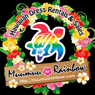
First, I decided what part of Furoshiki Hawaii I wanted to express with the logo. ① Being a Hawaiian brand (2) The logo of the operating company MuMuu Rainbow is a rainbow-colored turtle, so if possible, you can make use of the turtle motif. ③ Auspicious things. This can also be covered by a turtle. ④ If possible, express Hawaiianness ⑤ A thing that can express the simplicity of the concept of furoshiki, folding, folding, wrapping, and the colorfulness of Hawaii.
With that feeling, I came up with various ideas. Among them, I like animal motifs, so I thought about whales and owls, but I thought that I couldn't remove the turtle motif of Muumuu Rainbow, so I came up with various turtle ideas.

The first is to create a simple, modern image with the image of a turtle shell. I personally liked it quite a bit, but it wasn't popular around me. It was a little bit.
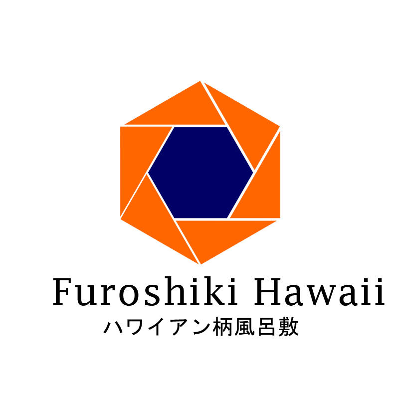
In the first plan, the corners were removed, but how about a square design to create the concept of more creases and folds? So, I captured the line in this hexagon. Luckily, I have 7 frames, so can I insert a rainbow color into them? So for the next idea.

I wish I could have made it more colorful, but I decided to use this logo with less color. I think Hawaiian Furoshiki is more colorful, brighter, and has more floral patterns than Japanese Furoshiki. I think it would be great if we could make that a strength. We look forward to your continued support with the new Furoshiki Hawaii logo. If you have any comments, please leave a comment.


Comments